Via Marvel App
Okay, a parking sign doesn't really qualify as art, but I love finding examples of graphic design making life a little better.
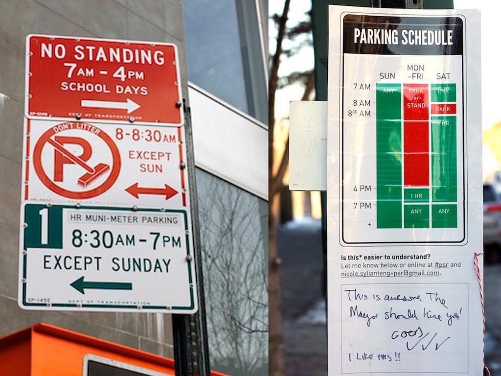
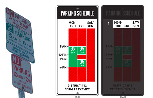
Parking signs aren't all that important in the grand scheme of things, but a poorly designed sign can really ruin your day, especially when you live in a city where they’re literally a joke.
Brooklyn graphic design enthusiast Nikki Sylianteng took the New York's labyrinthine parking sign, which on a typical street could stretch to several pages, and re-imagined them as user-friendly, visually-based infographic. Now instead of text, Sylvianteng’s signs show a Google Calendar-esque layout of when it’s permissible to park on a given street. It’s not perfect, but the signs speak for themselves. Which, in parking lingo, is saying something.
No comments:
Post a Comment