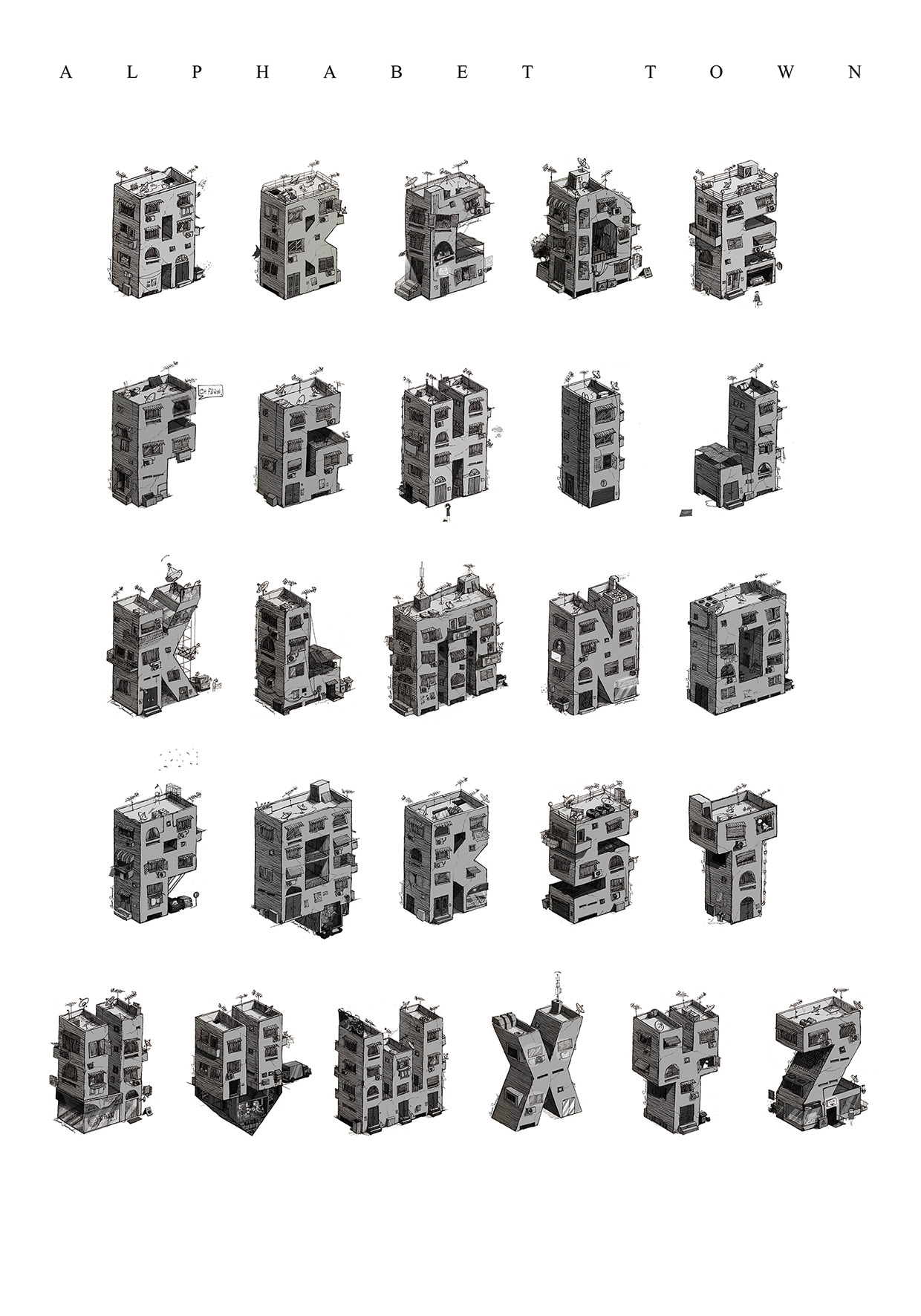
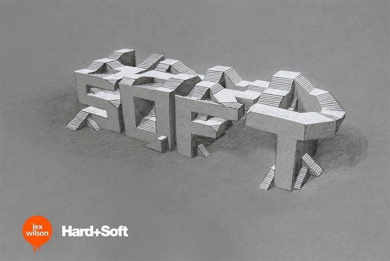
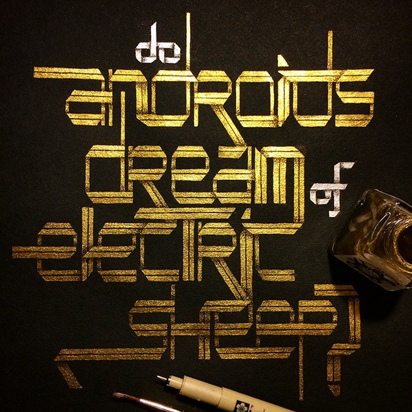
"Word as Image" by Ji Lee
Showing posts with label typography. Show all posts
Thursday, March 17, 2016
Tuesday, January 26, 2016
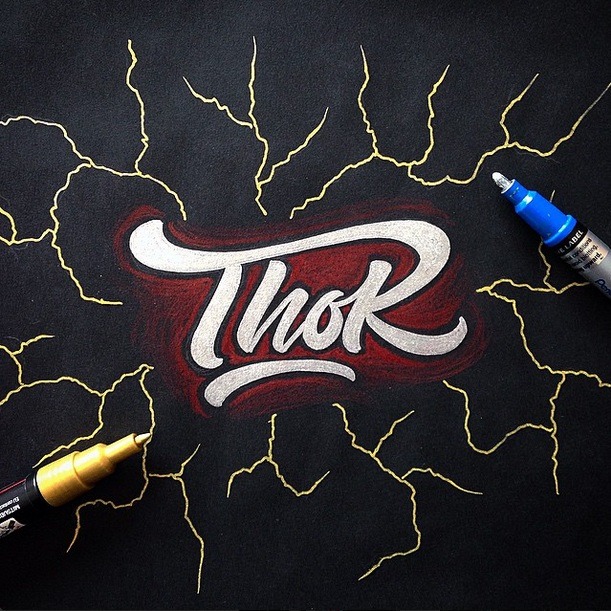
Posters: Star Wars Handlettering Quotes
The is a series of handlettering quotes from Star Wars, explore the combination of type and illustration.
Labels:
quotes,
star wars,
typography
Friday, August 21, 2015
Typography: Straight Outta DC
"Straight Outta DC" by Workman Says Things
Workman Says Things made some Straight Outta DC album covers featuring characters from DC Comics movies and TV shows using the free StraightOuttaSomewhere site.
Labels:
dc,
typography
Typography: 1950's Series Titles
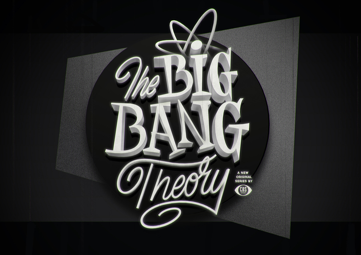
"1950's Series Titles" by Stellenbosch, South Africa-based Luke Ritchie
Popular TV series logos recreated using custom fifties-style typography.
I love the 50s style especially the black and white noir feel of these
images. Luke Ritchie brilliantly captured the personalities of these TV shows. I love the depth, texture,
and, of course, the style.
Labels:
television,
typography
Friday, August 14, 2015
Typography: Jake Weidmann
In July 2011, Denver-based artist Jake Weidmann was certified as a Master Penman through the prestigious International Association of Master Penmen, Engrossers and Teachers of Handwriting (IAMPETH), becoming the youngest member ever and only the the 14th Master Penman in the world.
In the fourth episode of Uproxx's Human series, Weidmann talks about his process, his inspirations, and his deep commitment to preserving the art of pen and ink.
I took it upon myself to really work obsessively on my handwriting everybody else in school had their laptops out in there are typing away and I had a pen in a pad of paper. …I practice a lot of different art forms but I particularly mix calligraphy into my artwork to give both the words and the pictures more life and a stronger message.
Labels:
typography,
video
Wednesday, June 10, 2015
Monday, May 25, 2015
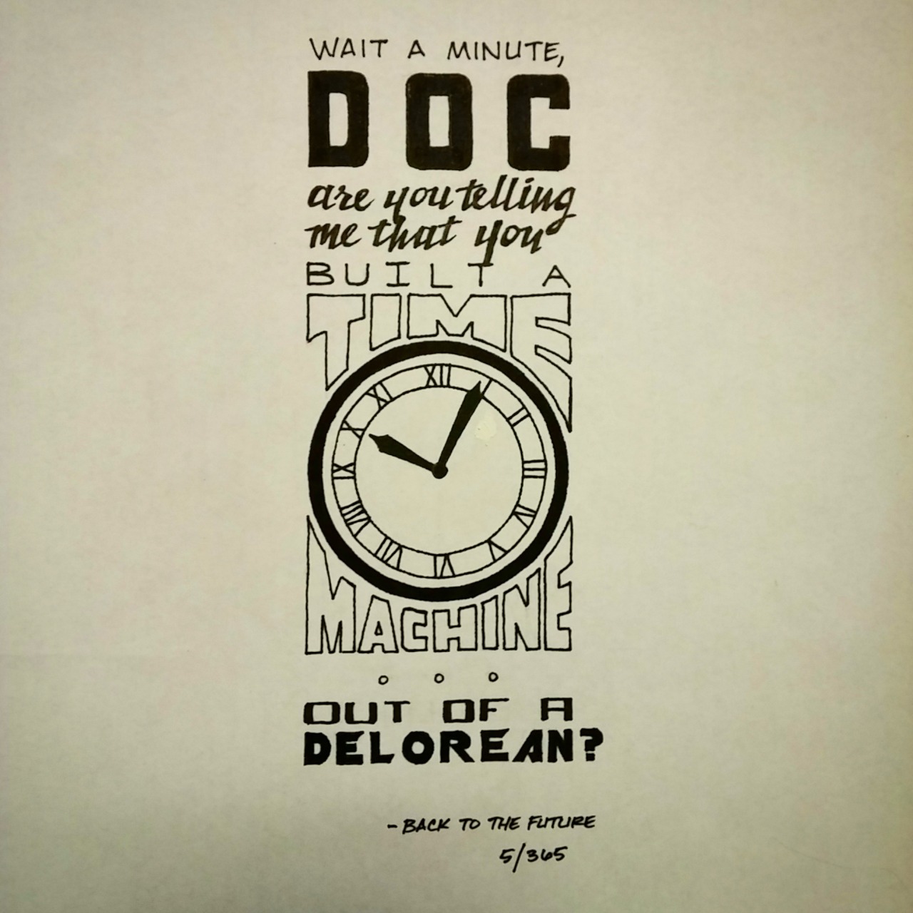
Typography: 365 Movie Quotes
Illustrator and graphic designer, Ian Simmons (ConflictStar on Reddit),
incorporates striking typography with iconic movie quotes in his take
on the "365 Days" project, in which he publishes a hand-lettered piece of
featuring movie quotes everyday. You can support him on Patreon or follow him on Tumblr to show your support.
Labels:
movies,
quotes,
typography
Tuesday, May 5, 2015
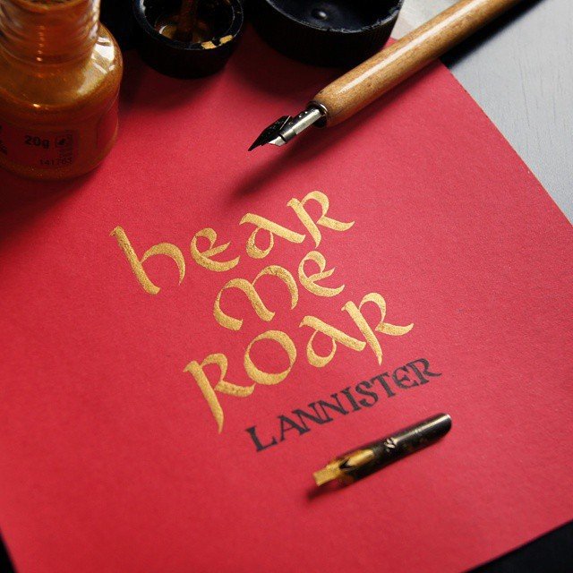
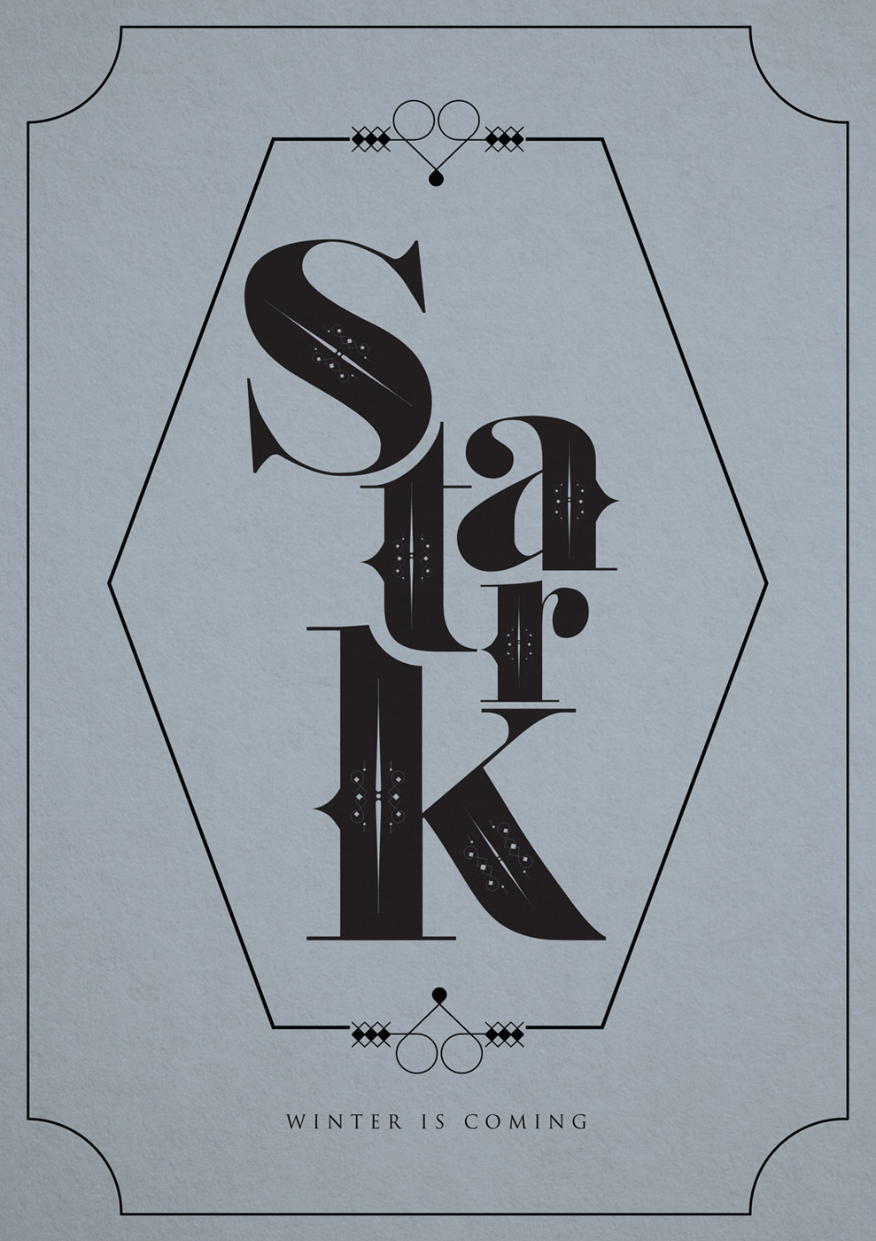
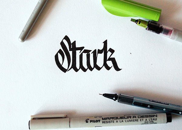
Typography: Game of Thrones Mottos
Maybe it's not traditional art, but I could stare a well-formed piece of calligraphy all day.
Labels:
game of thrones,
typography
Thursday, April 2, 2015
Tuesday, March 31, 2015
Thursday, March 26, 2015
Posters: Warcraft Classes
World of Warcraft Inspired Type Posters by Worcester, England-based Peter Fox
Prints available for purchase from Etsy. US$7.64
If these had been available a few years back, when I was heavy into World of Warcraft, I would have bought every one of these, wall space be damned. They would've gone on the ceiling if necessary. These day's I've cooled on the game, which was just a giant sinkhole for my time, so I'll just wrangle them into a desktop wallpaper instead.
Labels:
fantasy,
posters,
roleplaying,
typography,
video games,
world of warcraft
Thursday, March 19, 2015
Featured Site: MyScriptFont
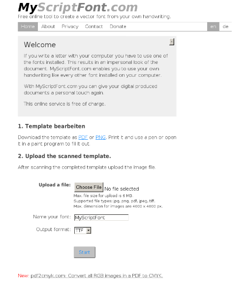
MyScriptFont is a free online tool that helps you to create a vector font from your handwriting. All you have to do is download the provided template in PDF or PNG, fill out the squares with a marker before scanning it at 150 or 300dpi in grayscale. After uploading it, you’re then able to download the resulting font as a TTF or OTF file. Check out how to install and use your exclusively created font here.
Labels:
featured site,
graphic design,
typography
Tuesday, March 10, 2015
Featured Site: Metaflop
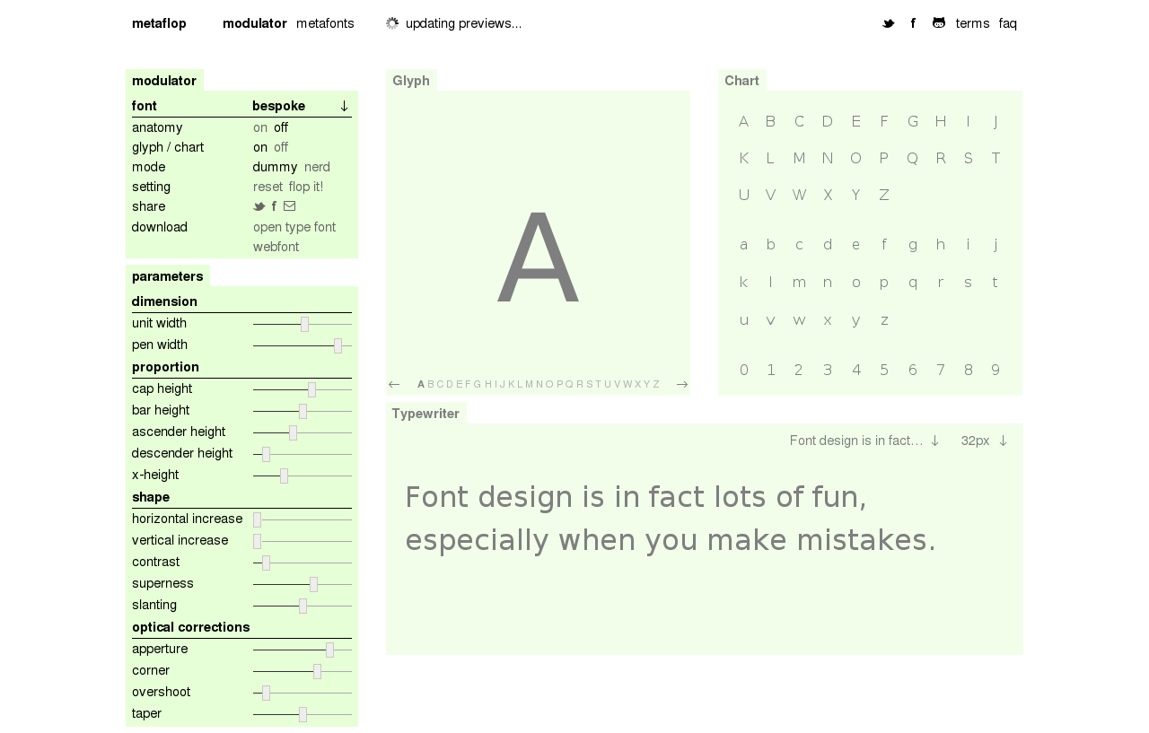
Metaflop by Swiss designers Marco Müller and Alexis Reigel
Metaflop is an
easy-to-use web app that lets users design their own fonts without the expense of typography software or the hassle of
dealing with the technical aspects of design, like programming language and coding.
Metaflop makes designing your own fonts as simple as adjusting a the app’s sliders to adjust a typeface's characteristics, such as cap height and ascenders, in real time. Once you're satisfied with your font design, you can easily download it as a .otf font for free. It's also a great way for new graphic designers to learn the terminology surrounding type design. If you've ever read about typeface terms like ascenders, cap heights, overshoot, descenders, and contrasts, there's no better way to figure out what these terms mean than by using a slider to change their variables and see how it changes a typeface in real time.
In an interview with It’s Nice That, designers Marco Müller and Alexis Reigel said: "We are aware that it is difficult to produce subtle and refined typographical fonts (in the classical meaning)… Nevertheless we believe there is a undeniable quality in parametric font design and we try to bring it closer to the world of the designers."
Metaflop makes designing your own fonts as simple as adjusting a the app’s sliders to adjust a typeface's characteristics, such as cap height and ascenders, in real time. Once you're satisfied with your font design, you can easily download it as a .otf font for free. It's also a great way for new graphic designers to learn the terminology surrounding type design. If you've ever read about typeface terms like ascenders, cap heights, overshoot, descenders, and contrasts, there's no better way to figure out what these terms mean than by using a slider to change their variables and see how it changes a typeface in real time.
In an interview with It’s Nice That, designers Marco Müller and Alexis Reigel said: "We are aware that it is difficult to produce subtle and refined typographical fonts (in the classical meaning)… Nevertheless we believe there is a undeniable quality in parametric font design and we try to bring it closer to the world of the designers."
Labels:
featured site,
graphic design,
software,
typography
Thursday, March 5, 2015
Typography: Fantastic Lettering
Fantastic Lettering on Everyday Objects by Worcester, UK-based Rob Draper
What I find so fascinating about Rob Draper's work isn't just the amount of detail he puts into each of his typography pieces, but rather, what he chooses to draw them on. The
canvas for his intricate lettering designs is usually everyday
disposable objects he comes across like paper coffee cups, napkins,
toilet rolls, or hot dogs.
Labels:
typography
Thursday, February 5, 2015
Documentary: Calligraphy & Lettering
"Calligraphy & Lettering '14" directed by Will Dohrn
Film-maker Will Dohrn has filmed a video of London-based artist and sign painter Ged Palmer demonstrating various lovely calligraphy and lettering techniques.
Labels:
documentary,
typography,
video
Documentary: Art of Letterpress
“The Art of Letterpress” is a brief documentary from The Folio Society demonstrating the craft of master typesetter Stan Lane, who has been creating beautiful volumes like the Letterpress Shakespeare series for a quarter century. Lane discusses the beauty of the labor-intensive process.
"Stan Lane, a master Typesetter and Printer, talked to us about the process of printing our Letterpress Shakespeare series.
Lane has been setting type for The Folio Society for 25 years and is one of the few craftsmen still skilled in the fine art of letterpress printing. Although labour-intensive, letterpress has a depth and elegance that modern printing cannot replicate."
Labels:
documentary,
typography,
video
Wednesday, January 28, 2015
Documentary: The Art of Letterpress
"The Art of Letterpress" is a documentary that explores the work of master typesetter and printer Stan Lane, who has been working with the London book publisher for a quarter century, creating beautiful volumes like the Letterpress Shakespeare series. Lane discusses the beauty of the labor-intensive process.
"Stan Lane, a master Typesetter and Printer, talked to us about the process of printing our Letterpress Shakespeare series.
Lane has been setting type for The Folio Society for 25 years and is one of the few craftsmen still skilled in the fine art of letterpress printing. Although labour-intensive, letterpress has a depth and elegance that modern printing cannot replicate."
Labels:
documentary,
typography,
video
Subscribe to:
Posts (Atom)